


Are you looking for paint colors that will achieve that modern farmhouse or fixer upper style? Let’s talk about some of the best farmhouse paint colors and I’ll share a few tips and tricks on how to pick that perfect color!
This post contains some affiliate links for your convenience. For more info, please see my full disclosures here.
What Makes a Color Farmhouse Style
Whether you’re a fan of farmhouse style or what I like to call modern farmhouse style, a lot of the design elements of these styles are not going away anytime soon, and paint is one of them. I consider farmhouse paint colors to be a timeless design element, and one that can still look great even if your decor taste changes over time.
Farmhouse paint colors have a soft look. They aren’t too bright, bold, or too dark. They tend to be neutrals with touches of grays, greige, greens, blues, and whites. These colors tend to give a slightly lived in look and add coziest and history to a room.

Favorite Painting Tools:

The Best Farmhouse Paint Colors
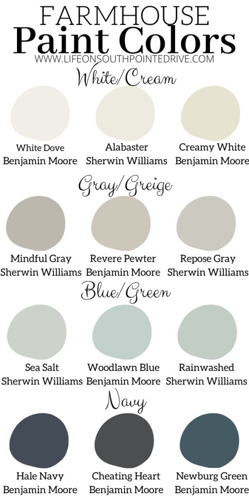
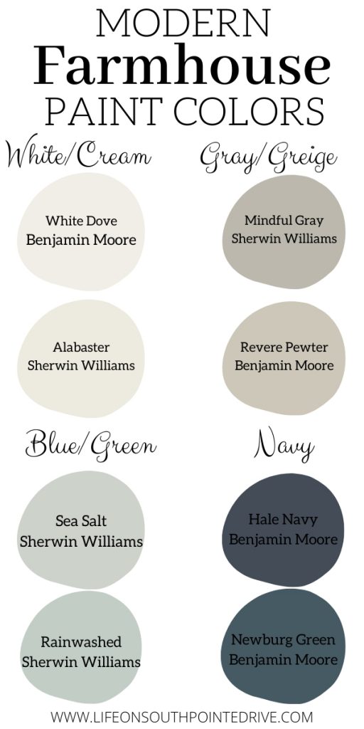
White/Cream
- Benjamin Moore White Dove (Favorite for Trim) – White Dove is a color I have been using recently in a couple of the spec homes I have been helping design. It is a soft white with a hint of gray. It’s one of my favorites to use on trim. I recently tried it out on walls and absolutely loved it! It gives a great warmth to the room without being too creamy.
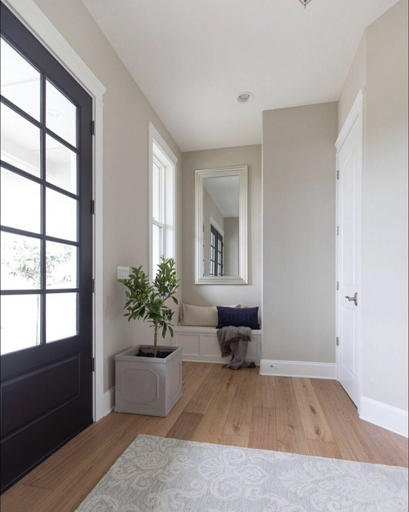
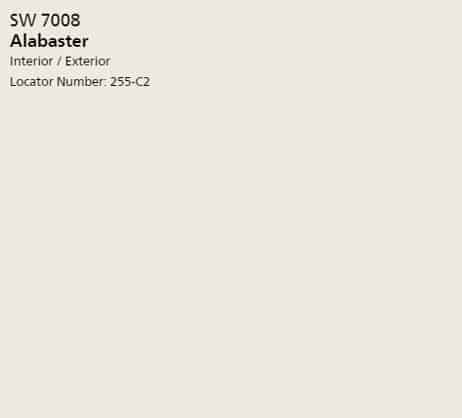
- Sherwin Williams Alabaster – up until recently this was my favorite white. It is still one of my favorites for trim, fireplaces, and doors. I also have this as the color of my shiplap in my entryway. It’s creamy enough to not be a stark white and feel cozy and inviting but doesn’t look yellow or dull.
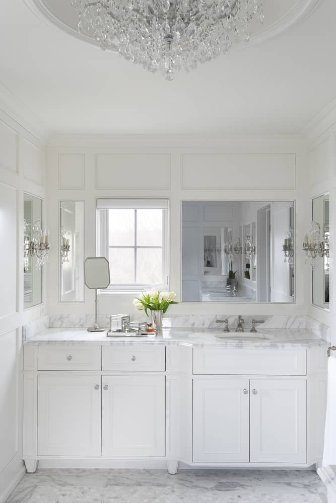
- Benjamin Moore Creamy White (Favorite for Cabinets & Doors) – Creamy White is my new favorite white for cabinets. It’s not a color that I would recommend using for trim or baseboards, but is a stunning color for cabinets and interior doors (to give a little contrast). I have recently paired Creamy White cabinets with White Dove walls and I fell in love with the contrast! It can be described as a warm beigey white.
- Sherwin Williams Natural Choice (Favorite for Walls) – Natural Choice is the color of most of the walls in my home. It’s nice and light and can look different depending on its surroundings. In my kitchen it looks like a very light creamy color with the dark cabinets and features of my kitchen. In my living room, which is brighter and has more blues and blush colors, it looks more gray. I looks perfect in every room.
Benjamin Moore White Dove {Source: Rebecca McAlpin/Semerjian Interiors }
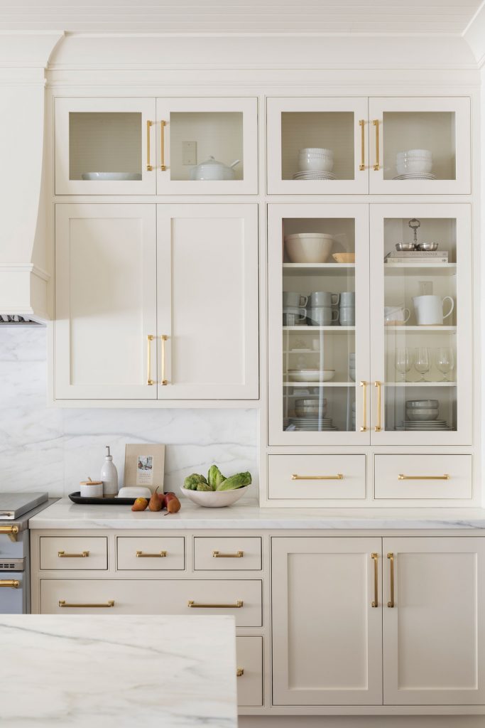
Benjamin Moore Creamy White Cabinets {Source: Studio McGee}
Gray
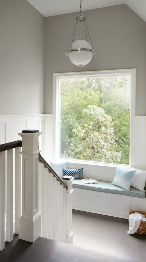
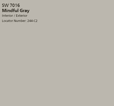
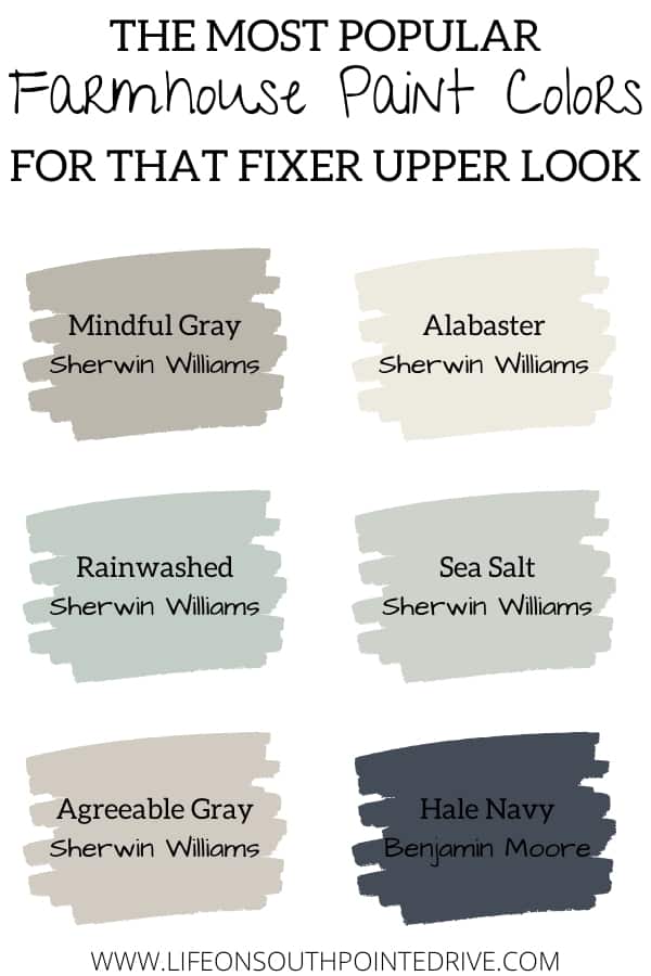
- Sherwin Williams Mindful Gray (Favorite Warm Gray) – Mindful Gray is more of a neutral gray with warmer undertones. I used this in my dining room and it gave me just enough warmth without being too overbearing or dark for the room.
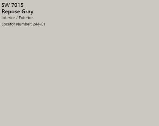
- Sherwin Williams Repose Gray – just like Mindful Gray, Repose Gray has more of a warmth to it. I personally haven’t used Repose Gray in my home, but I know a lot of bloggers have and it looks great.
- Sherwin Williams Light French Gray – Light French Gray is my favorite cooler tone gray. I have used this in my spare bathroom downstairs and it was exactly what the room needed to brighten it up a bit.
- Benjamin Moore Stonington Gray – Stonington Gray is another cool gray and has more of a blue undertone. Another really great option if you’re looking for a cool gray.
Sherwin Williams Mindful Gray {Source: Unknown}
Greige
- Benjamin Moore Revere Pewter (Favorite Greige) – Revere Pewter is a really popular greige, and I even debated once on painting my kitchen cabinets Revere Pewter before deciding to go a different way. This is the color I do have in mind to paint my bathroom vanities. It has both warm and cool undertones, but leans more toward the warm side and give such a great contrast when paired with true white trim.
- Sherwin Williams Agreeable Gray – Agreeable Gray is another greige that has both warm and cool undertones, but is less warm than Revere Pewter. This in mind is a go-to greige that I would recommend for walls. Like the name says, Agreeable Gray seems to be agreeable to just about anyone!
Benjamin Moore Revere Pewter {Source: Fridley Homes on Instagram}
Blue/Green
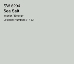
- Sherwin Williams Sea Salt (Favorite Blue/Green) – if you’re wanting to add a little color to your life, I think you can’t go wrong with Sea Salt. Depending on the time of day and how much natural light your room gets depends on how it looks. Sometimes it looks like a muted blue other times a greenish blue, but you can’t go wrong with it. It’s perfect to add a little pop of color into a bedroom or bathroom.
- Sherwin Williams Rain Washed – Rain Washed is very similar to Sea Salt, but a little brighter. If you’re looking for even more of a pop of color…go this route.
- Benjamin Moore Woodlawn Blue – Woodlawn Blue is considered to be in Benjamin Moore’s historic collection of colors that consists of time-honored colors. Woodlawn Blue would also look really great in a bedroom or bathroom.
Sherwin Williams Sea Salt {Source: Artsy Chicks Rule}
Navy
- Benjamin Moore Hale Navy (Favorite Navy) – navy is quickly becoming a color that is used more often in homes and is actually slowing becoming considered a neutral color. It is the perfect color to add a more dramatic effect in your home and looks great as an accent wall or for a bathroom with no windows.
- Benjamin Moore Cheating Heart – Cheating Heart is another great navy and is considered in Benjamin Moore’s classic collection. Such a timeless and classic color that can be added for a little pop in your home.
- Benjamin Moore Newburg Green – another one of Benjamin Moore’s historic collection colors, Newburg Green can either pass for a beautiful navy or sometimes look like a dark teal green depending on the light.
Benjamin Moore Hale Navy {Source: Life on Virginia Street}
What Color Paint Does Joanna Gaines Use
If picking out one of the above colors on your own stresses you out, you can’t go wrong with taking some advice from the pros. Here are what Joanna Gaines has said are some of her favorite colors that she uses in her own home:
Sherwin Williams Alabaster – Such a perfect color to trim, ceilings, and doors. And if you’re Joanna Gaines, the perfect color for your shiplap!
Sherwin Williams Silver Strand – a great option to give a little pop of color in your home. Joanna Gaines has used this in bathrooms, bedrooms, and mudrooms.

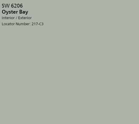
Sherwin Williams Oyster Bay – I have seen Joanna Gaines use this in bedrooms and it looks so beautiful and cozy.
Sherwin Williams Repose Gray – another really great gray that Joanna Gaines has used throughout her own home as well as a lot of projects she has done.
Sherwin Williams Sea Salt – I know I mentioned this above, but there is a reason Joanna Gaines thinks this is a beautiful color in bathrooms!
Sherwin Williams Mindful Gray – the place I originally found this gorgeous gray! It’s a favorite of Joanna Gaines in living rooms, entryways, and dining rooms.
Favorite Trim and Ceiling Paint Color
We can’t leave out the trim and ceiling paint. Here are a few colors that are sure to go with any of your favorite colors from above:
- Benjamin Moore Chantilly Lace – Chantilly Lace is such a popular color for trim, baseboards, doors, and ceiling paint. It is another perfect white that sometimes has a bit of a blue undertone and seems to make the home still feel cozy and bright.
- Sherwin Williams Alabaster – Alabaster is what I currently have as my trim paint in my home. I love the warmth of this white and it makes a perfect trim & ceiling paint color.
- Benjamin Moore White Dove (Favorite Trim & Ceiling Color) – again as shared above, White Dove is my new favorite color for trim and ceiling paint. It looks great with every color and has a beautiful contrast with the grays and greiges.
Great Door Colors
Now what about those doors? We can’t forget about the exterior of our house. Which farmhouse paint colors look beautiful and timeless on your exterior doors? Here are a few of my suggestions:
- Benjamin Moore Wrought Iron (Favorite Door Color) – Wrought Iron was the color of my front door at my old house and I loved it. It’s the perfect black/gray and looks to me more like a charcoal color. It looks especially great against cream or white painted brick houses.
- Sherwin Williams Anew Gray – if you’re looking for something to add a little contrast, but not wanting to add as much drama and warmth as Wrought Iron, then Anew Gray may be the fit. It’s such a beautiful gray and looks so pretty on your front door as well as painted on your window trim.
- Benjamin Moore Gauntlet Gray – not as dark as Wrought Iron but darker than anew gray, Gauntlet Gray is a true medium gray with warmth. It can really add that extra curb appeal when painted on the front door.
Benjamin Moore Wrought Iron {Source: Home Bunch}
Favorite Painting Tools:
How to Choose the Perfect Farmhouse Paint Colors
- Get Samples – this is probably the most important step when narrowing down your paint colors. Yes, you can get an idea of what a color will look like by looking online, but you really have no idea how it will actually look in your home until you try it first. Add in your paint budget to buy a few sample pints from the paint store and paint a couple of coats of each one beside each other in the room. This will give you an idea of how it will look in your room at different times of day and with your current decor. It’s much easier to paint over those sample coats than it is to have a whole room painted and then have to go back over it because you didn’t like it. Samplize is also a really great option for this. You can buy samples that you simply peel and stick to your wall and remove when you’re done.
- Know your undertones – another very important step in picking colors is knowing your undertones. I once painted my kitchen what I thought was a creamy white, but after getting it all painted realized it looked yellow during some parts of the day. Not all colors that look the same have the same undertones. One best way to determine a colors undertone is line up the paint swatches with the color family you are choosing from and then you will see that that gray you thought was gray actually doesn’t look gray at all when laying up next to other grays.
- Understand your LRV (Light Reflective Value) – so every paint color has what is called a LRV (Light Reflective Value). This determines how much light a color will bounce back into a room. You can find this on the back of the paint swatch. They range from 1-100 with colors of 70-90 really bouncing back a lot of light into a room and making it brighter. The lower the LRV, then less light it will bounce around and the more it will absorb the color making the room feel romantic, cozy, or moody. Depending on what mood you are going for in a room is going to determine what you would want your LRV to be.
- Lighten Up the Color – if you have found the perfect color, but you think it may be a little too dark for your space, ask the paint associate to lighten up the color by about 25 – 50%.
- Check out Pinterest – Yes, I really said to check out Pinterest. Like I said before you never really can tell what a specific color will look like in your home by looking at a photo, you can get a good idea. Also a lot of bloggers share their experience with the color and their thoughts which can give you some really good insight on what to expect from a color.
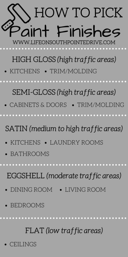
How to Select a Paint Finish
So you’ve found the perfect color and the last thing you want to do is mess up the look by selecting the wrong type of paint finish. Here are a couple of reminders when selecting a paint finish:
- High Gloss – best for kitchens, trim, & molding
- Semi-Gloss – Trim & molding, cabinets, and doors
- Satin – Kitchens, Laundry Rooms, and Bathrooms
- Eggshell – Dining Room, Living Room, and Bedrooms
- Flat – ceilings
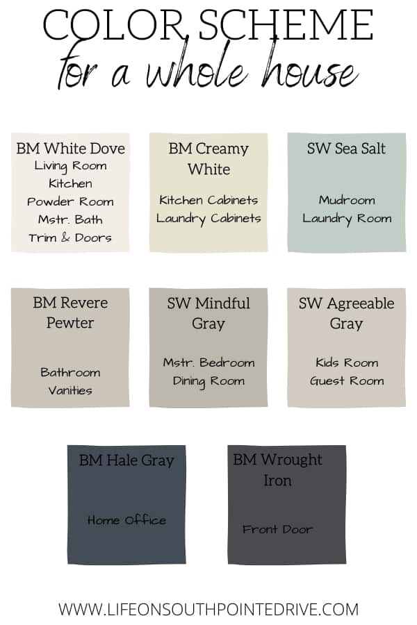
Whole House Paint Colors
Now that I have shared some of my favorite colors and even showed you Joanna Gaines whole home paint colors, I’m going to show you how easy it is to pick from those colors to create your own whole house paint color pallet. Here is one I put together as an example of the flow of these colors!
More of The Best Home Paint Colors Posts:
- Best White Paint for Trim
- The Best Shades of White for Interiors
- How to Paint Baseboards Like a Professional
- Repose Gray: Sherwin Williams Repose Gray Review
- Most Popular Exterior Paint Colors
- The Best Gray Paint Colors
This post contained some affiliate links for your convenience. For more info, please see my full disclosures here.


")


